With social distancing and stay-at-home/shelter-in-place mandated in many parts of the US (and worldwide) because of the novel coronavirus COVID-19, wineries and retail outlets in general have been forced to innovate when it comes to selling their wines to consumers. Specifically, with many people staying at home, they have taken most -if not all- of their shopping online. According to recent Nielsen data, online sales of alcohol in the United States have increased 5-fold compared to the same time period last year. Additionally, WineDirect data indicate that online wine sales in the month of March 2020 were up 40% compared to March of 2019. While online wine purchases aren’t enough to make up for the lost income resulting from COVID-19 stay-at-home orders, it has certainly helped and is likely a revenue stream that wineries and other retail outlets will need to utilize and improve upon in the foreseeable future.
While there is a lot of research on wine selection and purchase behavior in an in-person retail setting, there is very little knowledge about how consumers perceive images of wine bottles online, and how these images may drive purchase intention.
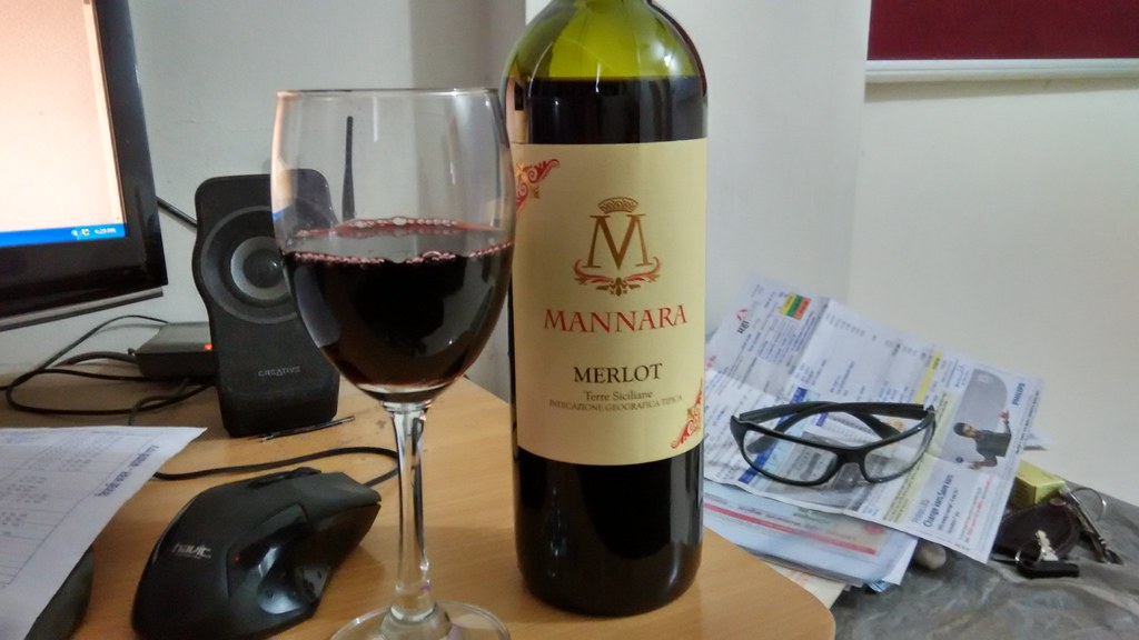
In the “real world”, wine labels are created by a printing process, which uses the colors cyan, magenta, yellow, and black (CMYK). Using these four colors, many different colors can be derived, including metallic colors like gold and silver.
Online, however, color appears a bit differently. Computer, cell phone, and other devices use the red, green, and blue color mode (RGB). With the RGB color mode, there are fewer color combinations than the CMYK mode, and metallic colors can not be created (or at least not exactly how they are in the CMYK mode). Therefore, an image of a wine label may look different online than it does in “real life”, which could elicit a sense of skepticism on the part of the consumer in regards to the authenticity of a wine. In other words, if the wine bottle looks different in real life than it does in the image online, the consumer might lose trust in that brand and possibly be less likely to purchase that brand in the future.
A new study, available online and to be printed in the July 2020 issue of the Journal of Retailing and Consumer Services, aimed to explore consumer perception of authenticity of wine labels viewed online, and how this perception might influence purchase intention. Results of the study might provide some insight on wine label design for wineries for optimal impact both in person and in an online retail setting.
Brief Methods
Prior to the main study, a smaller exploratory study was performed to assess what consumers might view as the most important characteristics of a wine label online, the results of which were used to design their larger experiment described shortly.
Exploratory Study
For this small pilot study, 21 consumers were interviewed to determine three things: what parts of a wine label influence their purchase choice, how they felt emotionally during their last online wine shopping experience, and what makes a label “authentic” to them.
These interviews provided the researchers with some important insights. First, the consumers described different colors in terms of “heraldic” vs “vivid” colors. Additionally, the image of a chateau was the most commonly mentioned icon identified by the small consumer cohort. Finally, consumers often described labels as either being “visually complex” or “minimalist”.
These interviews and insights allowed researchers to come up with a set of wine labels that represented all of three criteria listed above: heraldic vs vivid color, with or without the image of a chateau, and high vs low visual complexity.
These images were validated by the consumers and were thus the labels used in the main experiment.
Main Experiment
215 people participated in this study. (Note: it was not clear, but I assume the research was done in France based on the location of the study authors).
8 wine labels were created for this study utilizing different combinations of heraldic vs vivid color, with or without the image of a chateau, and high vs low visual complexity.
A fake e-commerce website was created for this experiment, which used responsive design that could be used on different devices, with a neutral background color to avoid distractions.

All participants were screened for color blindness and all had perfect of corrected-to-perfect vision.
The following parameters were measured and analyzed: authenticity, purchase intention, pleasure, and knowledge of wine.
Selected Results
Exploratory Study
- The exploratory study indicated that consumers felt a wine label showed “authenticity” when it contained an image of a chateau, simple colors, and low visual complexity.
Main Experiment
- Authenticity had a positive effect on pleasure and purchase intention.
- If a label was viewed as authentic, it increased “liking” of the wine label and also increased the likelihood to purchase that wine.
- Heraldic colors on a label were seen as more authentic than vivid colors and also increased purchase intention.
- The image of a chateau did not significantly affect authenticity or purchase intention.
- Lower visual complexity was seen as more authentic and also increase purchase intention.
Conclusions
Overall, this study provides some insight into the role of authenticity in online images of wine labels, and how this authenticity might influence purchase decisions by a consumer in the online setting (and thus impact wine label design decisions).
The most authentic labels appeared to have heraldic colors (gold, silver, etc) and lower visual complexity. Based on previous research unrelated to wine labels, the researchers posited that heraldic colors on the wine label may be seen as “less risky” and may lower the chances of the consumer selecting the “wrong” wine. Participants also preferred less visual complexity in the wine labels – perhaps too much going on adds a sense of confusion on the part of the consumer and thus lowers authenticity in their minds.
While these results are interesting and may provide some guidance on how to design a wine label for the online consumer, there are some limitations.
First, it was a relatively small study. I suppose as an exploratory/pilot-type study, that was to be expected, but it is a reminder that it may or may not be repeatable with a larger sample size.
Second, research has shown cultural differences in purchase behavior from one wine region to another around the world, so it’s probably safe to assume that the purchase behavior of online consumers would be no different. The results here may not apply to a consumer in Australia or China, but then again, more research is needed to ascertain this.
Third, does this sample reflect the demographics of the wine consuming/purchasing population as a whole? According to the study, participants were 64% men, 36% women, 20% under 20 years old, 38% between 20 and 34 years old, and 20% between 35 and 44 years old (I assume the remaining 22% were older than 45). According to Wine Market Council 2018 data, 56% of wine drinkers are female and 44% are male. Additionally, 6% of wine consumers were between the ages of 21-23, 36% between the ages of 24-41, 19% between the ages of 42-53, 34% between the ages of 54-72, and 5% over the age of 73. Of course, these age ranges are not the same between the two sources, however, it’s clear that the demographic representation of the study presented today may not reflect the wine consuming population of the United States (and possibly other places—-I am just looking at US data for today).
Forth, this study was performed and completed before the COVID-19 pandemic and before online shopping went into overdrive. Would we see the same results if the study were performed today? Or would consumers be less picky about authenticity considering the state of affairs in many places in the world? Consumers are more or less “forced” to purchase more online these days, so would they be so discriminating? No one has the answer to that right now, so we have to go with the research that we have for now until more becomes available.
It is likely that online shopping isn’t going to go away, and wineries/retailers need to adapt and adapt fast to the changing retail climate and the “new normal” if there is such a thing. Though the study presented today is small, it is a good starting point for more research on the subject of wine label design and wine purchase behavior in an online setting. I’m curious to see what new research finds, particularly now that the retail environment has so markedly changed.
Stay well, everyone.
Source:
1 comment for “Wine Label Design for the Online Consumer: How the Thumbnail Projects Authenticity and Influences Purchase Behavior”